UI DESIGN
ART DIRECTION
PHOTO SELECTION (Permanent banners)
The goal of this redesign is to align pvh.com with our new branding, especially in usage of fonts, as well as build a design centered around the users and the content they seem to be engaging with most. Overall, the purpose was to make it simpler, and more efficient to navigate and see all the content. The template is based off of the current vendor’s platform capabilities while also understanding how we want our brand to show up. Bold fonts and square assets are a main aspect of this brand.
DESIGN | ART DIRECTION | PHOTO SELECTION
Annual campaign design for NYC Pride. Emphasizing the color bars and clean neutral photography, or conversely adding color and energy with color light photography.
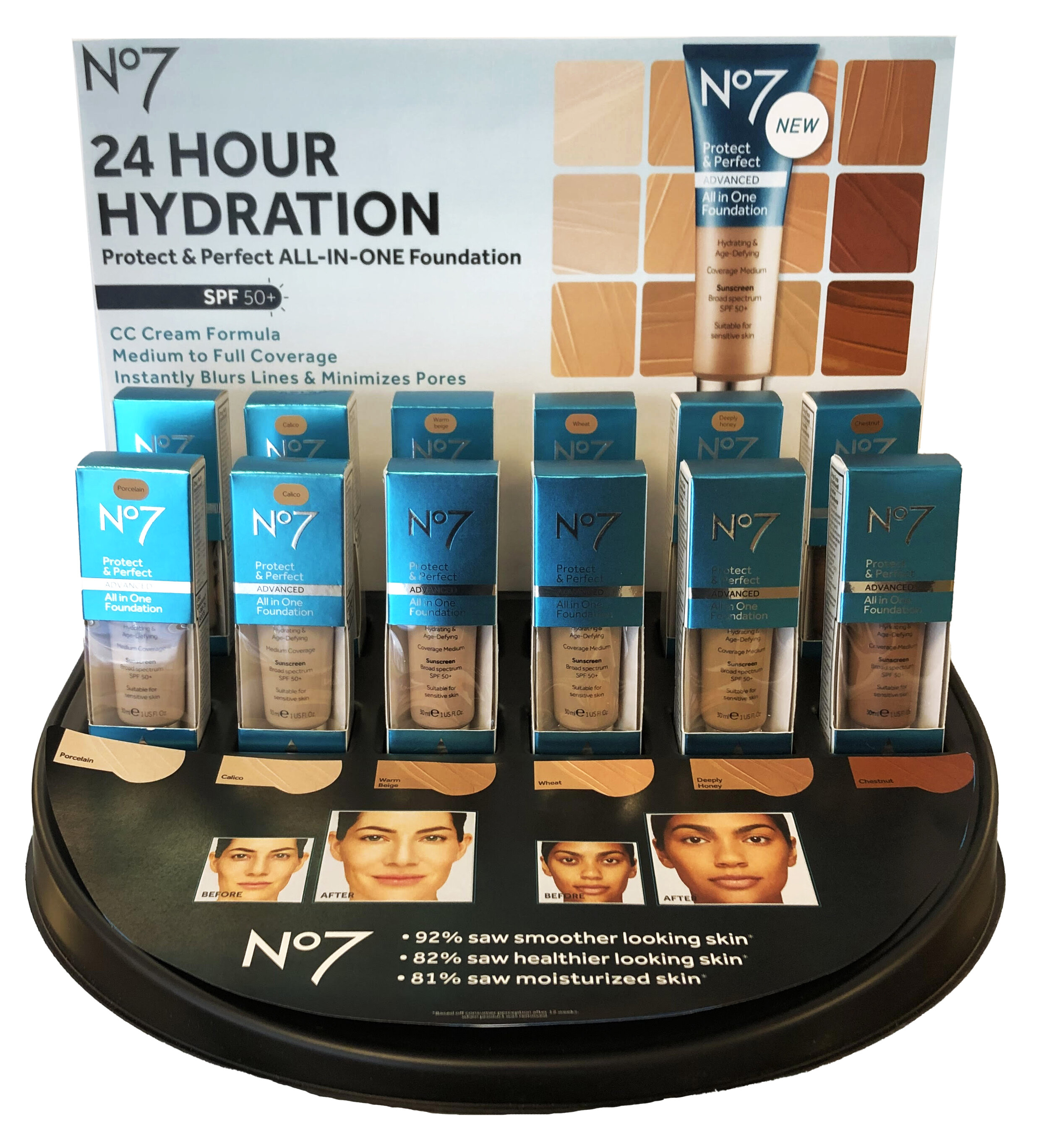
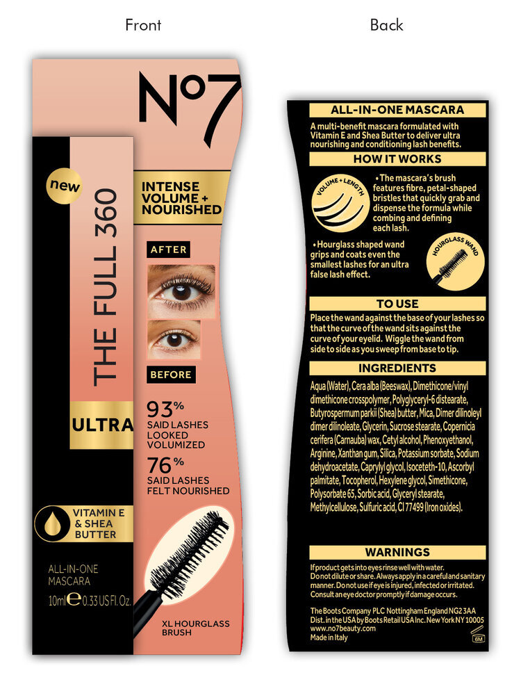
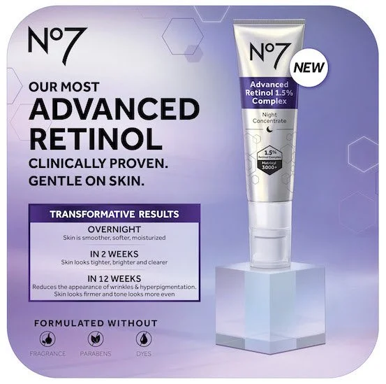
This was No7’s product launch of the year. The task at hand was to develop launch displays and an in-store takeover campaign that highlighted the new product, its ingredients (with ‘free from’ claim), and before/after results while incorporating a locally developed model image.
I retouched this model image and took the initiative to ground her within a hexagon shape for campaign consistency, shaping the way for the rest of the design.
Stock image research and testing for the ingredient images used.
Develop roundel to call out America’s #1 Serum Brand.
Designed for optimal customer interaction and legibility of display in store.
Created a more aesthetically pleasing results timeline grid for in-store takeover assets.
MANAGEMENT | CONTENT ORIGINATION | ART DIRECTION | IMAGE COMPOSITE
Tasked with improving the us.boots.com DTC site. This was done by completing a digital audit across all partner retailer sites. Responsible for site visual design, site map, and content calendar for homepage updates, branded pages, e-blasts, and landing pages.
Simplified homepage sub banners to align better the boots brand and allow feature banner to be prominent.
Cleaned up and modernized site and e-blast header + footer, and main banner sliding functionality.
Implemented branded landing pages allowing for better user experience.
E-blast header and footer were also updated to match that of the website, both of which now incorporating our social channels.
Lead digital calendar and strategy in terms of homepage, e-blast, and landing page focuses.
EVENT DISPLAY + MATERIALS | ART DIRECTION | IMAGE COMPOSITE & COLORING
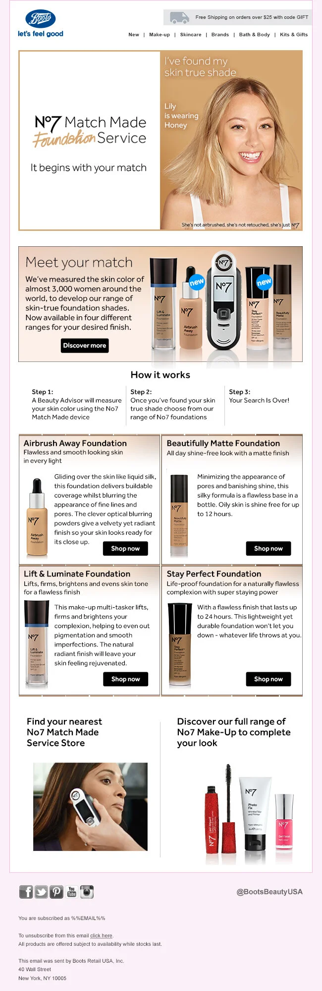
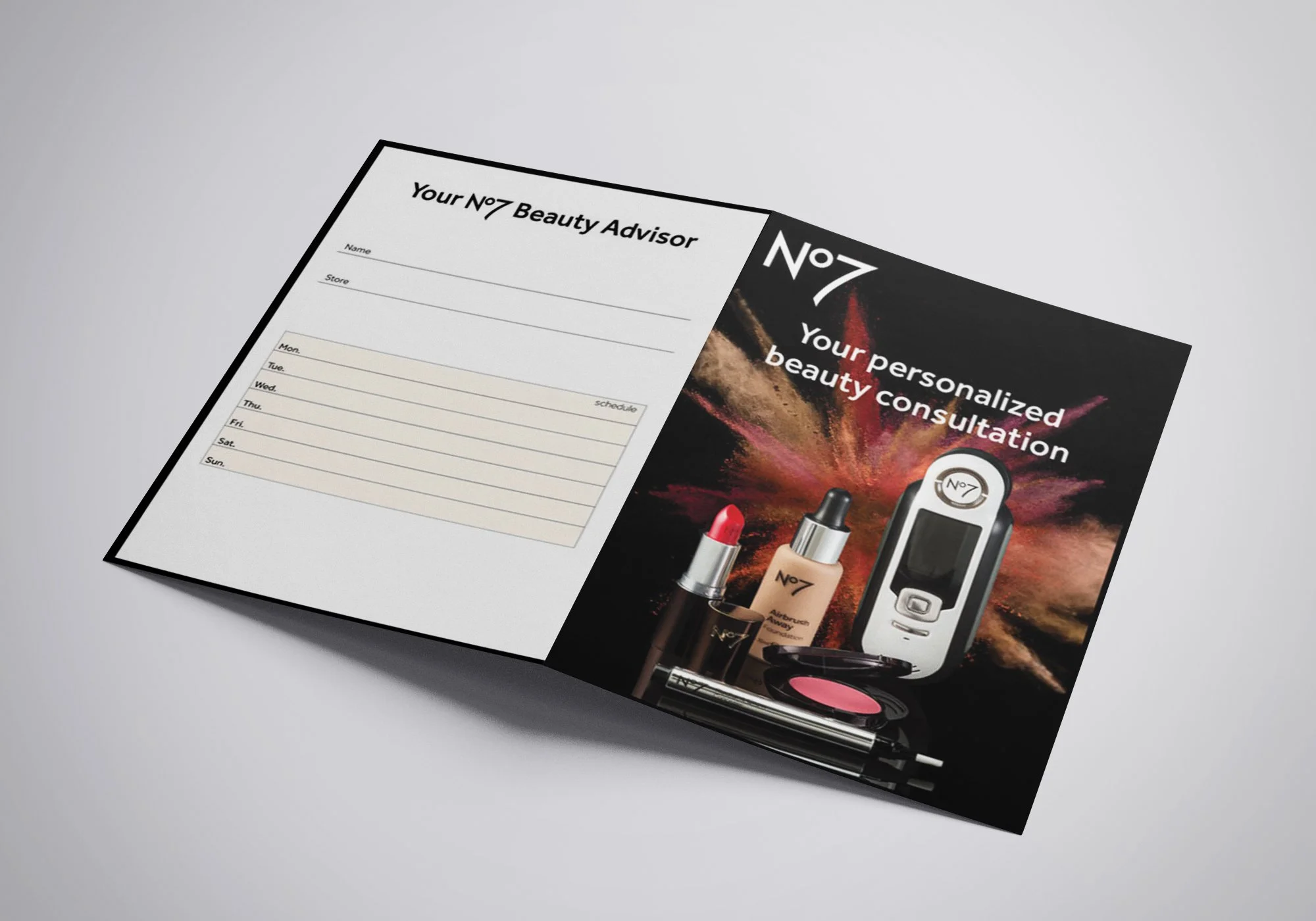
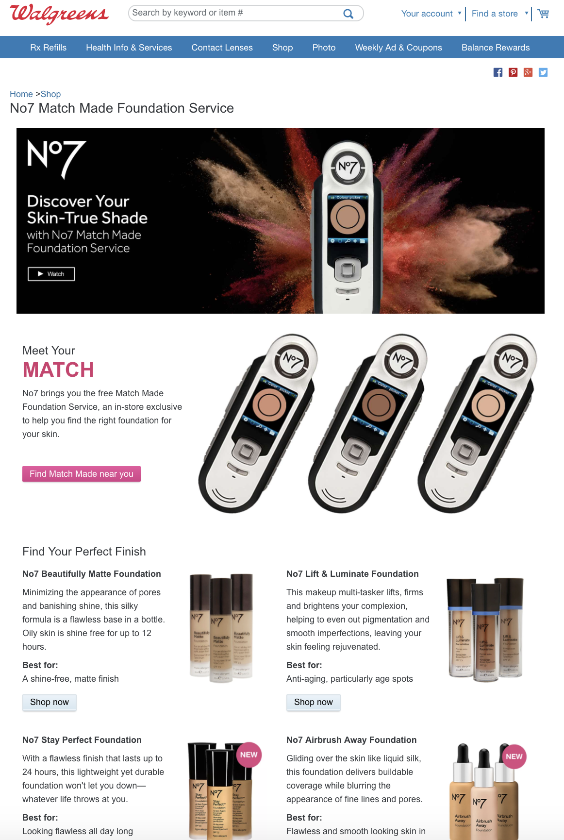
Walgreens.com and us.boots.com landing pages and email blast. No7 Match Made app loading screen. In-store coupon and on shelf promotion.
Training and educational grid to correlate shades across categories. Customer personalized shade look book. ULTA Event large format signage.
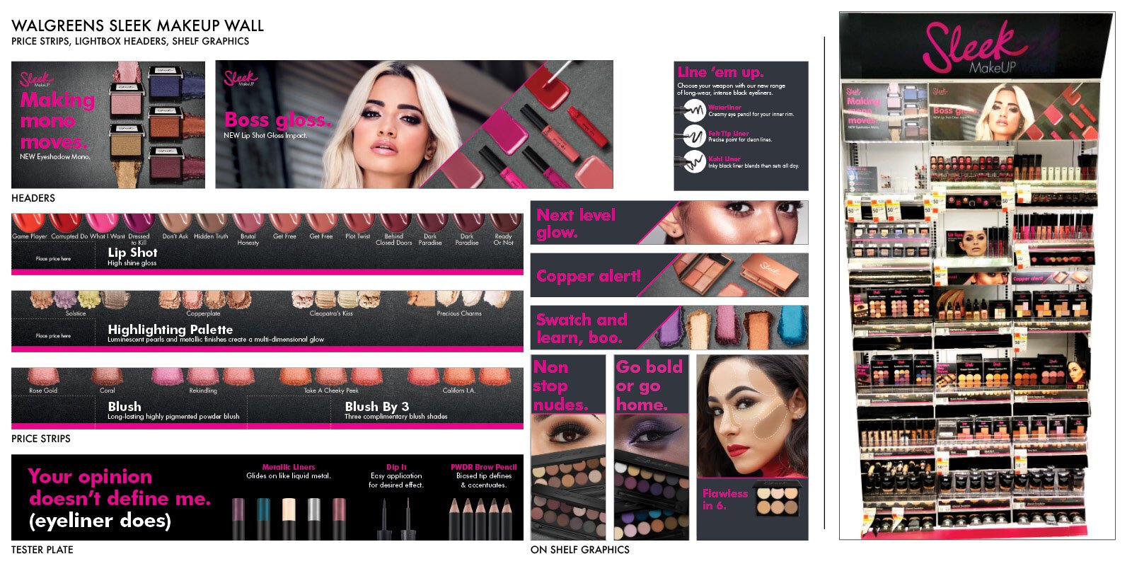
ART DIRECTION | IMAGE COMPOSITING | PRINT PRODUCTION & PRESS
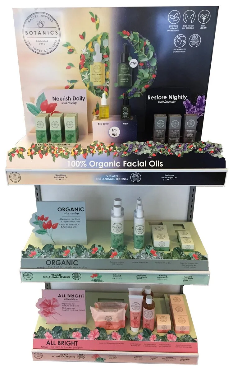
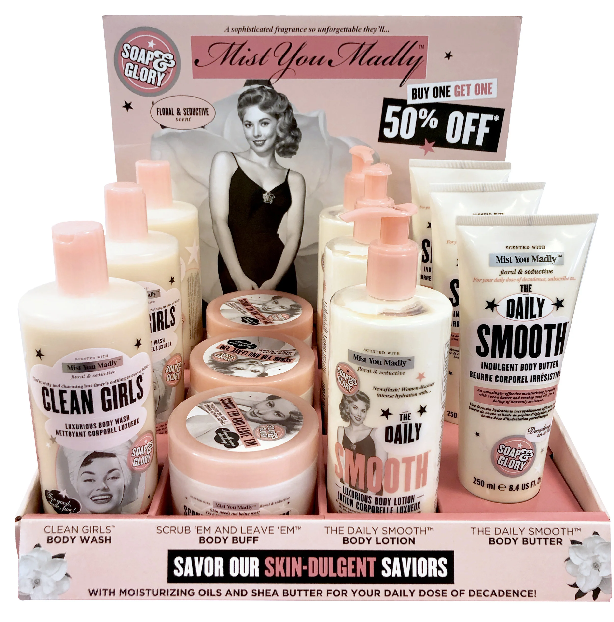
Collection of in-store graphics from permanent bi-annual transition artwork, as well as semi-permanent display units including counter units, towers, endcaps, and more.
Brands: No7, Soap & Glory, Botanics, YourGoodSkin, CYO, Sleek Makeup
Retailers: Walgreens, Duane Reade, Target, Ulta Beauty
ART DIRECTION | VENDOR MANAGEMENT
Collaborate alongside customer marketing and brand teams.
ART DIRECTION | ILLUSTRATION
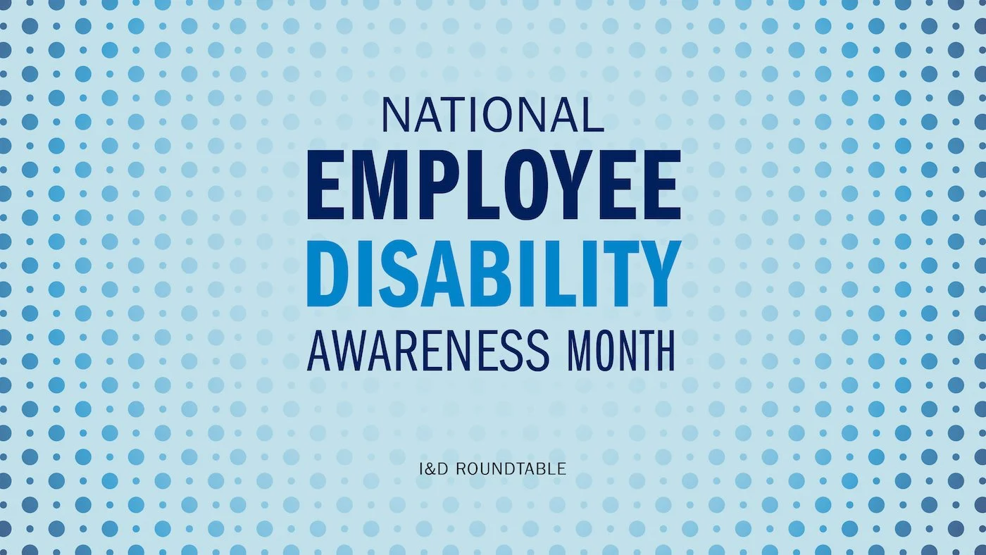
PVH POV Video intros and animation illustration assets developed with research for each event. Storyboard and work in cohesion with Motion Designer to see vision through.
Storyboard and artwork provided to a motion designer
Storyboard and flat artwork provided to a Motion Designer
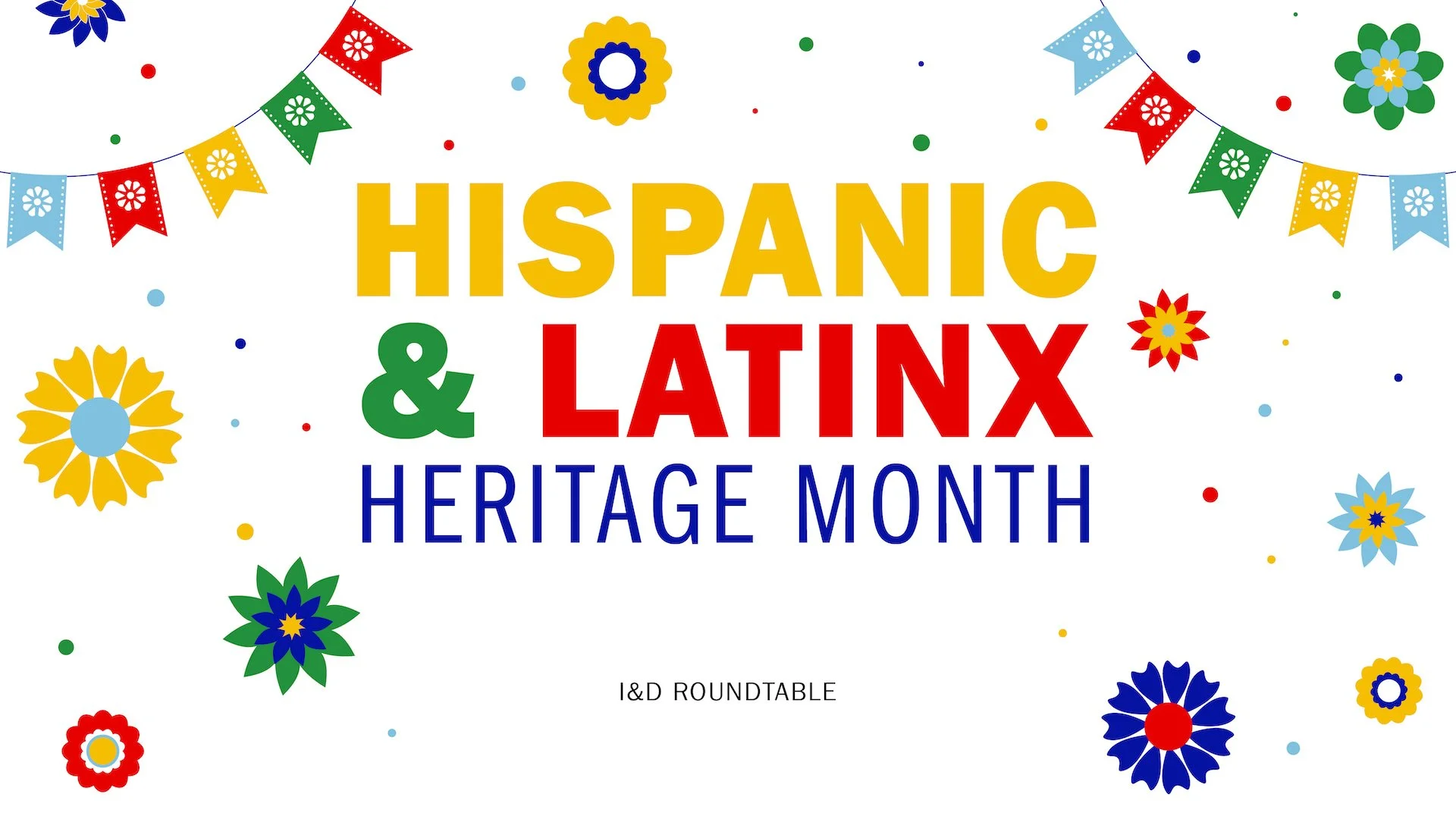
Hispanic & LatinX Heritage Month Intro Card Graphics
Storyboard and flat art provided to a Motion Designer
Storyboard and flat artwork provided to a Motion Designer
CREATIVE DIRECTION
Start up with education at its forefront. Design of the logo/symbol to resemble a human or user as a simple icon.
The website was designed using Sketch and I provided the HTML/CSS to backend coding team, working with them to ensure proper UX/UI.
Based off research of other educational website look/feel and information.
ART DIRECTON
Coupons | Magazine Pages | In-Store Promotions | Display Materials
Brands: No7, Soap & Glory, Botanics, YourGoodSkin, CYO, Sleek Makeup, Hertz
Retailers: Walgreens, Duane Reade, Target, Ulta Beauty
Hertz Bus Panel Ads, Printed Banners
CREATIVE DIRECTION
Canopy is a NYC based hotel and spa. It is a destination for locals and tourists to escape the hectic and non stop nature of NYC. Canopy provides a warm, peaceful, calming stay to allow you to reset your mind, body, and energy. The personalized pampering and serene space allows you to realign and reclaim you to get yourself ready to take on what NYC and the world has to offer after your stay. Photography and color palette designed to help calm and uplift clients with a high end look and feel.
CONCEPT | CREATIVE DIRECTION | DESIGN
Reebok boys t-shirt line focusing on fun illustration, sport, gaming, and impactful color and textures.
Stones Throw & Burton Competition Submissions
ILLUSTRATION | PHOTO COMP | PRINT PRODUCTION
No7 HydraLuminous Franchise Product Sleeves
Higher impact packaging, more informational with custom illustrations and created a consistent water splash used across all to emphasize the ‘hydration’ benefits. Worked in partnership with brand team and vendor to ensure best production of material, color, and fit around product and product visibility on shelf.
No7 Lash Impact Lash Serum
Developed following existing template of mascara product packaging, incorporating model and product imagery and retouching. Work alongside brand team to implement visualization of claims and product effectiveness, with vendor to ensure best iridescent material used, with legal to ensure claim usage, text size, etc.